Happy Birthday Dad

Jerry 2012

My Dad reached a milestone last year. He turned 60. I decided to sketch a portrait of him based on a photo I had taken a few years prior as a gift. Now, I've finally gotten around to posting the finished work here. Only took me nine months. 

I wanted to try something new with the piece. I came up with the idea of making it a dual layer portrait while working with Photoshop one night.  The first layer is shadows and midtones in pencil on a piece of white paper and the second layer is highlights in white contĂ© on a sheet of translucent vellum. The result was an image with more depth than I had hoped. I loved the way it turned out and my Dad was thrilled when he opened it. 

Both my parents were always very supportive of my choice to pursue a creative career. They expressed to me that if they had felt more free to become anything they wanted to be when they were younger that they would have been more creative; my Dad an actor, my Mom a photographer. I consider myself lucky to have had that vital encouragement to be anything I wanted. Thinking about it now I've sought out a similar type of attitude in my group of friends; the vast majority of my favourite people are creative, passionate, supportive and inspiring. I've chosen to surround myself with these kind of people and I'm constantly reminded why that was a wise move. It's an unintentional, subconscious collaboration at times. It provides me with a muse for all occasions and motivation to be more interesting and multi-faceted. I highly recommend seeking out the most awesome people you can possibly find. All three of the portraits posted on this blog are of loveable, amazing people with a personal connection to me. That fact made completing these pieces all the more enjoyable and kept me eager to continue drawing on a more regular basis. 

Posted in , | Leave a comment

Available Resources

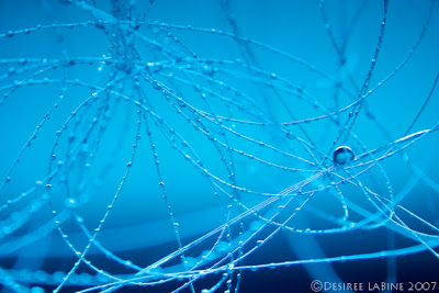
Wire Series I  2007

Wire Series IV  2007

 
Wire Series II  2007

Everything Above the Kitchen Sink - Every once in a while I find myself stuck. All I want to do is take some pictures, but I'm in a situation with limited resources. Whether it's faulty/broken equipment, unpreparedness, new on the spot ideas or an impromptu urge to shoot, sometimes the most ideal or professional equipment isn't available. 

It can be frustrating beyond belief, not to mention stressful if you're shooting for a job or at an event that is a one time deal. However, it can be more satisfying to see magic happen in the viewfinder when it's half D.I.Y. project. Equipment shortage is a good thing - one must learn to, how you say, roll with the punches and become more aware of ones surroundings (ohhmmmmmmmm...). Relying too much on the fanciest technology to 'git 'er done' can backfire if you: a) over use it or b) haven't looked at the manual long enough to fully take advantage of said jacked up gizmo.

These images were taken with a fluorescent under-mounted kitchen light and the base of a small lava lamp. I used coloured acetate sheets for filters because I didn't have any actual photo gels on hand. The first two images were shot with acetate over the lights and the last one was taken with an acetate sheet in front of the lens - making for two different looks. The back splash was a brushed silver finish so it ended up working as a sort of soft reflector. Making for a  convenient clean-up I shot these scenes suspended over my kitchen sink using invisible tape; all the dripping water just drained away. 

Everything outside the frame looked really thrown together, unimpressive & cheap - my Mom was even cooking dinner as I clicked away, but that didn't matter on the contact sheets. I ended up with photos I love to this day. I just wish I still lived in that house so I could take advantage of that ghetto set up again.

Posted in | Leave a comment

Timing is Everything

Queen West, East of Euclid  2012

Fog is a Photographers Friend - For the last few days there has been so much fog in Toronto! Brought on by unseasonably warm temperatures mixing with cooling winds or some such other thing a meteorologist would say... Whatever the reason it's been eerie, drifting and full of photographic opportunity. Fog makes almost anything look mysterious, creepy or soft & angelic. 

I happened to luck out and arrive in the right place at the right time today. Two minutes before I shot this there was so much fog the CN Tower wasn't visible at all, and five minutes after I shot it the fog got misty enough to make for nothing more than a hazy looking mess of a picture. I got all my settings idealized and stood in position waiting for the best seconds to shoot, not knowing when that moment would come. If I'd arrived 10 minutes later I'd have been too late. As an added bonus the sun was out too - making for an unusual weather combination. Unusually beautiful. 

Posted in | Leave a comment

New & Improved

Melody 2012

Pretty Lady - Last night I put together a frame made from simple pre-cut matte, a clear acetate sheet, and matte board cut to size for backing to showcase this pencil sketch. For less than $10 the sketch is protected and looks so much classier than a loose piece of paper. I posted an earlier version of this sketch the other day (see here). At that point I'd stepped back from this drawing for a little while while working on other things. I discovered two things upon finishing it this week.

1 - Tools make all the difference - It had been so long since I sketched something that required this level of detail, I'd forgotten how much proper paraphernalia matters. I completed the Eric 2011 sketch and the majority of this one with only a mechanical .7mm pencil. I didn't have the proper eraser either, but struggled through illustrating like that, kind of oblivious to an easier way. Between then and now I bought a 12 pencil set, rubber eraser, kneadable eraser & good sharpener.  The new tools made me eager to complete this sketch and start another one. Investigating different brands and types of equipment is inspiring and worth the investment.

2 - I wasn't feeling this piece when I set it aside for a few weeks. Putting it on the back burner turned out to be the best thing I could have done. Returning to it didn't feel like a chore, but something I looked forward to & by picking it up with fresh eyes I was able to see what areas needed the most work right away, and therefore finished it quickly & confidently.

Posted in , | Leave a comment

A Pair Trumps the Ace

1 - Seating in the Scalzi  2010

2 - Angels of St. Peters  2010

3 - Upper Suite 2010

4 - By the Bay Window 2010

Greater than the sum of their parts - Pairing two images is one of my favourite tricks. It's an easy way to make images that may fall flat if viewed independently of one another into something much more dynamic. 

1 - Two subjects in two different places - As long as there is at least one unifying feature in each photo this type of pairing can easily show patterns in colour, shape and composition without seeming like a weird set.
2, 3- Two subjects in the same place - Sometimes one image just isn't enough to convey the atmosphere of a room or the breadth of a moment. By showing more than one part of the environment viewers are able to grasp the scene more fully.
4 - One subject from multiple angles - Often a scene looks marvellous pulled back, but there is a smaller component of it that demands special attention too. By taking one photo of the whole scene and another to showcase a smaller element within it, it can highlight the importance of that element or draw attention to a detail that may otherwise be missed.

P.S. When two images work together it should be apparent immediately - if you have to do tons of perfecting to get it just right then you are probably trying too hard.

Posted in | Leave a comment

It's My First Time

Croc Snack 2011

My First (and only) digital painting! No one told me the hardest way to attempt this was on a laptop, using only the trackpad instead of a wireless mouse.... but hey, if it's not challenging, why try it?

I used two photos for reference & created it 100% with Photoshop with a lot of trial and error brush work. I thought framing it tightly around the crocodiles head would illustrate the appropriate tension, making it seem like the dragonfly has nowhere to go (Mwahahaha!). I picked orange for the background to really make the prey pop.

I ended up being very happy with the result. It gave me the desire to try out digital painting some more, though I haven't decided what my next subject matter will be yet. I think I'll stick to an animal theme for now....


Posted in | Leave a comment

Whoa.... Trippy

Contest Entry - 2011

Using three stock images (tiger, strawberry & wall clock) I made this kaleidoscope image by isolating each subject from it's respective background with the pen tool in Photoshop and then patterning them together in a new blank document. It was created for a contest on deviantart.com and logical reasoning for using one cat, one fruit & one clock together wasn't provided. It ended up being pen tool/compositing practice more than anything.
I'd like to try this technique again, except I'd use my own photos & a more cohesive theme like kitchen utensils or street signs.

Posted in | Leave a comment
All works ©Desiree LaBine 2012. Powered by Blogger.

Search

Swedish Greys - a WordPress theme from Nordic Themepark. Converted by LiteThemes.com.